Sarah Luu's Wireframes
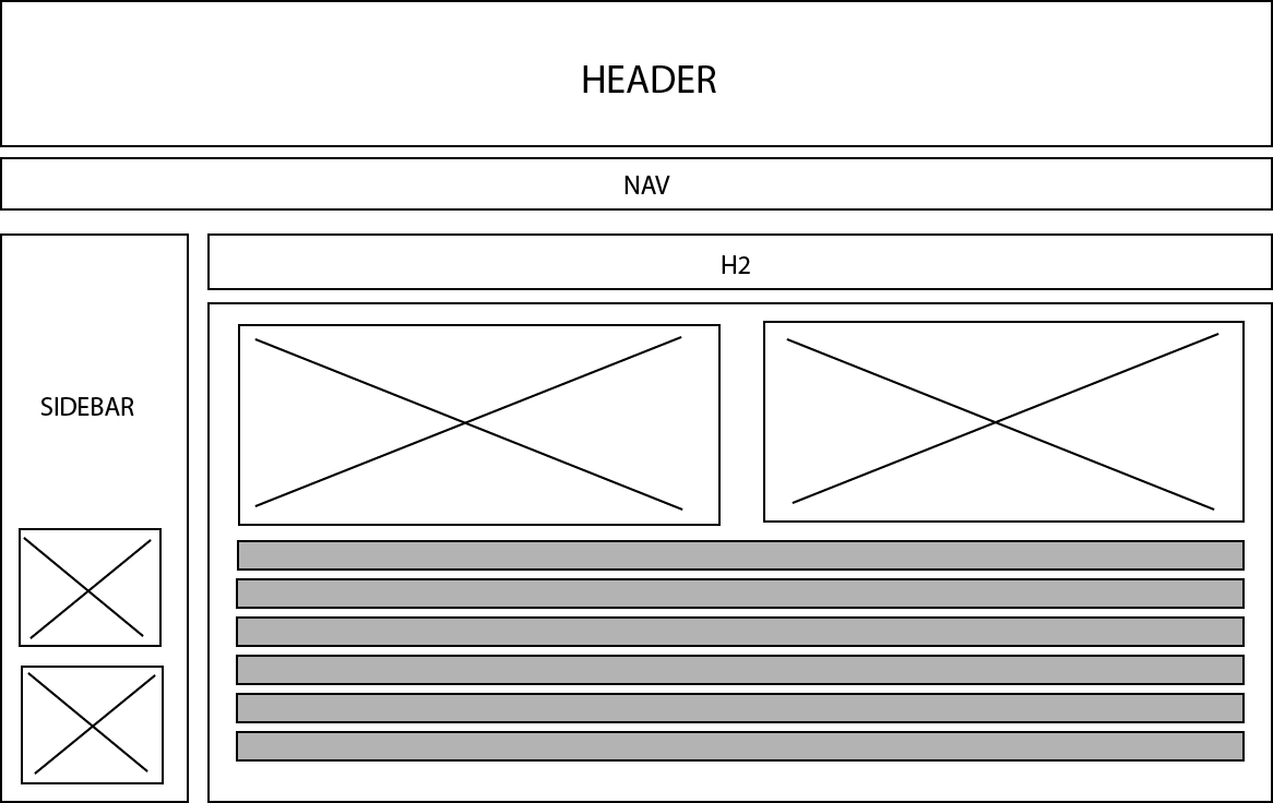
Desktop Wireframe

I am making a website for a local sushi restaurant. The body, sidebar, and navigation font will be "Abel" and the font for the headings will be "Walter Turncoat". For the colours, I will choose a black background and use accent colours that can most commonly be found in sushi such as: white, orange, red, yellow, and green. Potential pictures will include various types of sushi, sashimi, and appetizers that can be found in Japanese restaurants.
One of the images in the sidebar will be the logo of the restaurant with a brief description of the restaurant's history.
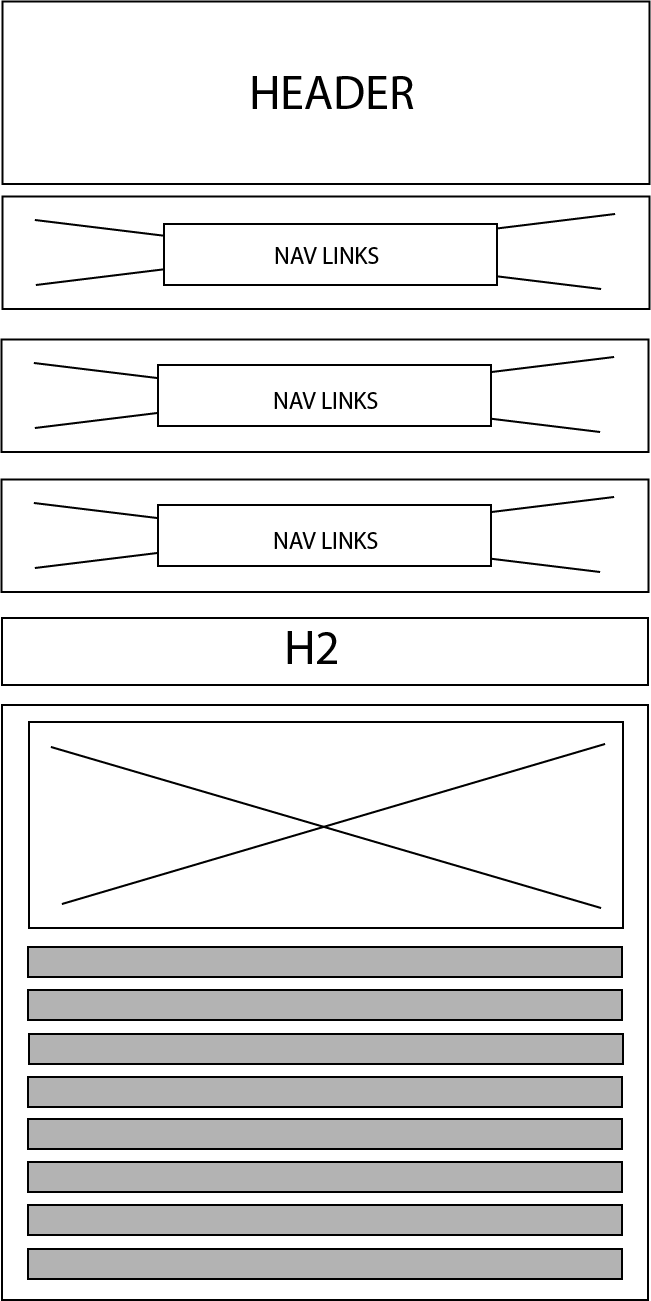
The creative elements for the mobile layout will essentially be the same. The navigation is combined with the sidebar in the mobile layout. The text for the navigation links overlay images meaning that they are clickable. For example, the first navigation link can be titled "Appetizers" and the background image will be miso soup or seaweed salad so users know that they can click the image and it will transfer them to the "Appetizers" section of the website.
Mobile Wireframe
